
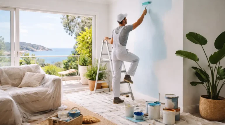
Choosing a new colour for your home sounds simple until you stand in front of hundreds of paint chips that somehow all look white, beige or slightly different white. Suddenly, the decision feels bigger than it should.
The right House Paint Colours can completely change how your Sydney home feels. I always look beyond what is trending and consider the architecture, natural light, surroundings and the way you actually live in the space.
If you want a useful starting point, explore these House Paint Colours ideas before picking up a paintbrush.
1. Start With Your Home’s Architecture
Before you fall in love with a particular shade, take a good look at your home.
A colour that looks fantastic on a sleek contemporary townhouse may feel completely out of place on a Federation terrace. Likewise, a bold modern palette can sometimes fight with the details of an older Sydney home.
I like to start by identifying the strongest architectural features. Look at:
- Roof colour and material
- Brickwork or rendered walls
- Window frames
- Doors and trims
- Verandahs and balconies
- Fences and landscaping
- Decorative details
Your exterior colour scheme should make these features work together rather than compete for attention.
For example, a warm neutral can soften a rendered façade, while a deeper accent shade can make timber windows or a front door stand out beautifully.
The goal isn’t to make every feature shout. It’s to make the whole house look intentional.
2. Pay Attention to Sydney’s Natural Light
Natural light can completely change how House Paint Colours appear.
This matters particularly in Sydney, where homes can receive very different amounts of sunlight depending on their orientation, surrounding buildings and landscaping.
A colour that looks soft and warm inside a paint shop can appear much brighter when direct sunlight hits it. On the other hand, a darker or cooler colour may look quite different on a shaded wall.
Before committing, I recommend testing your preferred colours on the actual walls.
Look at them:
- In the morning
- Around midday
- In the afternoon
- On an overcast day
- From across the street
This simple step can save you from the classic “That looked completely different on the sample card” moment.
3. Consider Your Existing Exterior Materials
Your walls aren’t the only thing wearing colour.
A successful exterior palette should work with the materials that you plan to keep. Think about your roof, driveway, stonework, bricks, tiles, timber and metalwork.
For instance, warm sandstone and terracotta can pair beautifully with earthy creams, warm whites and muted greens. Cooler grey brick may work better with crisp neutrals, charcoal accents or understated blue-grey tones.
| Existing feature | Colours worth considering |
| Red or warm brick | Cream, warm white, muted green, charcoal |
| Sandstone | Beige, off-white, olive, earthy tones |
| Grey brick | Soft white, grey, charcoal, blue-grey |
| Timber | Warm neutrals, olive, muted blue |
| Rendered walls | Almost any coordinated neutral or accent palette |
You don’t need to match every material exactly. Instead, look for colours that complement the existing palette.
That distinction makes a big difference.
4. Don’t Ignore Your Roof and Surroundings
When choosing House Paint Colours, look beyond the walls.
Your roof usually occupies a large visual area, so its colour can influence the entire exterior palette. The same applies to fencing, paving, gardens and neighbouring homes.
Sydney suburbs also have their own visual personalities. A coastal home surrounded by pale landscaping may suit a different palette from a leafy inner-west terrace or a modern suburban property.
I like to think of the house as part of a bigger picture rather than an isolated object.
Take a walk around your street. Look at nearby homes. Notice the colours that feel natural in the area and, just as importantly, the ones that look completely out of place.
You don’t need to copy your neighbours. You simply want your home to feel connected to its surroundings.
5. Think About Your Home’s Heritage and Character
Sydney has plenty of older homes with architectural details worth preserving.
If your property sits within a heritage conservation area or has heritage significance, don’t automatically follow the latest colour trend. Research the property’s architectural period and consider colours that complement its original character.
The City of Sydney’s heritage repainting guidelines recommend considering the building’s period, architectural details and surrounding streetscape when developing a colour scheme.
That doesn’t mean every older house needs to look like a museum piece. You can still create a fresh, contemporary appearance while respecting the home’s character.
For heritage properties, I would also check local council requirements before starting exterior painting.
6. Use the 60-30-10 Approach
If you’re struggling to combine several House Paint Colours, a simple proportion rule can help.
Try thinking of your palette as:
- 60% main wall colour
- 30% secondary colour
- 10% accent colour
For an exterior, your main colour might cover most of the walls. The secondary colour could appear around trims, garage doors or architectural sections. Then you can use a stronger accent on the front door or selected details.
For example:
Main: warm off-white
Secondary: soft greige
Accent: deep charcoal
Or:
Main: muted sandstone
Secondary: warm cream
Accent: dark olive
This approach gives you enough contrast without turning the façade into a colour experiment.
And yes, three colours can be stylish. Seven usually requires a very good reason.
7. Test Paint Colours on the Actual Wall
This is one of the most important tips I can give you.
Don’t choose your final colour from a tiny sample alone.
Paint a reasonably large test patch directly onto the surface. If you’re comparing several shades, place them far enough apart so you can see their differences clearly.
Then live with them for a few days.
You might discover that:
- A cool white looks too stark in full sun.
- A beige looks pink beside your brickwork.
- A grey becomes noticeably blue in shade.
- A darker colour looks fantastic around the front door.
- A warm neutral works better across the entire façade.
Paint samples tell you what a colour can look like. Your actual house tells you what it will look like.
What Are Some Popular House Paint Colours for Sydney Homes?
There isn’t one perfect palette for every Sydney property, but several colour families consistently work well across different architectural styles.
| Colour family | Overall feel | Works well with |
| Warm white | Clean and welcoming | Timber, brick, stone |
| Soft beige | Relaxed and timeless | Sandstone, gardens |
| Greige | Modern and understated | Charcoal, timber |
| Muted green | Natural and calming | Landscaping, timber |
| Soft grey | Contemporary | White trims, dark accents |
| Charcoal | Bold and sophisticated | Light walls, timber |
| Earthy tones | Warm and grounded | Brick, stone, greenery |
The best choice depends on your property’s architecture, surroundings and natural light.
Common Mistakes to Avoid When Choosing Paint Colours
Even beautiful colours can look wrong when you use them in the wrong way.
Avoid choosing a colour only because it looks great in a magazine. Your home’s lighting and materials will influence the final result.
Also avoid using too many competing colours. A carefully controlled palette usually looks more sophisticated than a collection of unrelated shades.
Another common mistake involves ignoring undertones. Two whites can look completely different because one contains warm yellow or beige undertones while another leans towards blue or grey.
And finally, don’t rush the decision.
A few hours spent testing colours can save you plenty of frustration later.
How Do I Choose House Paint Colours That Suit My Home?
Start with the things you cannot easily change.
Look at your roof, brickwork, stone, flooring, landscaping and permanent fixtures. Then consider your home’s architectural style and the amount of natural light it receives.
From there, narrow your selection to two or three main options and test them on the actual surfaces.
I find this approach much more reliable than starting with a favourite colour and trying to force everything else around it.
Conclusion
Choosing House Paint Colours becomes much easier when you stop treating it as a hunt for one perfect shade.
Instead, think about the entire picture – architecture, natural light, existing materials, landscaping, street character and the mood you want to create. Test your shortlisted colours, give yourself time to see them in different light and don’t let the latest trend make the decision for you.
A well-planned colour scheme can give your Sydney home a fresh personality while still feeling timeless and connected to its surroundings. If you’re ready to take the next step, Get in touch with our team and discuss your painting project with experienced professionals.
Frequently Asked Questions
What colour is best for the exterior of a Sydney home?
There isn’t one universal best colour. Warm whites, soft neutrals, greige, muted greens and earthy shades can all work well, depending on your home’s architecture, light and surrounding materials.
Should exterior house colours be light or dark?
Both can work. Light colours can create an open, bright appearance, while darker shades can make a home look more dramatic and contemporary. Your roof, landscaping and natural light should influence the decision.
How many colours should I use on my house exterior?
For most homes, two or three coordinated colours provide a balanced result. You can use one dominant colour, a secondary shade and a smaller accent colour for architectural details.
Should I test House Paint Colours before painting?
Yes. I strongly recommend testing shortlisted colours on the actual wall. Natural light, surrounding materials and surface texture can make a colour look very different from a small sample card.
What colours work well with red brick houses?
Warm whites, creams, earthy neutrals, muted greens and charcoal can complement red brick. Always test the colors beside the actual brick because the undertones can vary considerably.