
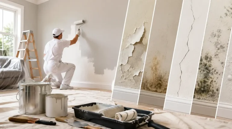
Your walls do more than sit quietly in the background. The latest Interior Painting Trends can set the mood, make rooms feel more spacious and completely transform your home’s personality.
In Sydney, where modern apartments, coastal homes and character-filled terraces all sit side by side, colour choices have become much more considered. The latest Interior Painting Trends focus on warmth, personality and practical living rather than simply following whatever colour happens to be fashionable this month.
If you’re thinking about refreshing your home, these Interior Painting Trends can help you create a space that feels current without looking like you copied a showroom catalogue.
1. Warm Neutrals Are Replacing Stark Whites
White will always have a place in Australian interiors, but the icy, clinical white of previous years is gradually giving way to warmer shades.
Think soft beige, creamy off-white, warm ivory, mushroom and subtle sand tones. These colours create a calmer backdrop while still keeping rooms bright.
For Sydney homes, warm neutrals work particularly well because they complement timber flooring, natural stone, linen furniture and plenty of indoor greenery.
I especially like this approach in open-plan living areas. Instead of using one harsh white across every wall, you can introduce a warmer neutral that connects the kitchen, dining and living zones.
Try this: Pair a creamy wall colour with white ceilings and natural timber furniture. The result feels polished without becoming overly formal.
2. Earthy Colours Bring the Outdoors Inside
Australians have always had a strong connection with nature, so it makes sense that earthy shades continue to influence interior design.
Olive green, muted terracotta, clay, ochre, dusty brown and eucalyptus-inspired tones can add depth without overwhelming a room.
This is one of the Interior Painting Trends I would consider if your furniture already features natural materials. Timber, rattan, stone and wool can look fantastic against earthy walls.
You don’t necessarily need to paint the entire room either. An earthy feature wall behind a sofa, bed or dining table can create a focal point without turning your home into a rainforest-themed café.
The trick is restraint. Pick one dominant earthy shade and let the rest of the room support it.
3. Colour Drenching Creates a More Dramatic Look
Ready to move beyond the traditional feature wall?
Colour drenching takes one shade and uses it across multiple surfaces, including walls, doors, trims and sometimes the ceiling. Instead of breaking the room into separate visual sections, the technique creates a more immersive feel.
Deep green, muted blue, warm beige and sophisticated charcoal can work particularly well with this approach.
I’d use colour drenching in rooms where you want atmosphere rather than maximum brightness. A study, bedroom, reading nook or formal dining room can handle a richer treatment beautifully.
For smaller Sydney homes, you can also use the technique selectively. Try it in a compact powder room or hallway for a surprisingly stylish result.
4. Soft Blues Are Bringing a Calmer Mood
Blue never really disappears from interior design, but the way people use it keeps changing.
Instead of relying solely on navy or bright coastal blue, homeowners are exploring softer shades such as dusty blue, powder blue, grey-blue and muted ocean tones.
These colours can make bedrooms and living spaces feel relaxed without looking overly themed.
That makes blue particularly interesting for Australian homes. You can capture a subtle coastal feeling without covering the room in obvious beach-house clichés.
Pair a soft blue wall with warm timber, cream textiles and brushed metal finishes for a contemporary look.
If you’re working with lots of natural light, test your chosen shade at different times of the day. Sydney sunlight can make a colour look dramatically different from how it appears under indoor lighting.
5. Bold Colour Blocking Adds Personality
Not every wall needs to play it safe.
Colour blocking uses two or more contrasting colours to create defined visual areas. You could paint a geometric section behind a desk, create a half-wall effect or use a strong colour around an architectural feature.
This approach suits young professionals who want their homes to feel individual rather than generic.
For example, combine warm beige with muted green, dusty pink with burgundy, or soft blue with a deeper navy.
The key is choosing colours that actually talk to each other. You want contrast, not a colour argument happening on your wall.
Among current Interior Painting Trends, colour blocking gives you plenty of room to experiment without committing to an entire room in a dramatic shade.
6. Darker Colours Are Creating Cosy, Sophisticated Rooms
For years, many homeowners avoided dark paint because they worried it would make rooms feel smaller.
That rule needs a little retirement.
When used thoughtfully, deep colours can create a sophisticated and surprisingly comfortable atmosphere. Charcoal, forest green, deep blue and rich brown can make a room feel intimate rather than cramped.
The secret lies in balance.
Use good lighting, lighter furniture or contrasting artwork to stop the room from feeling heavy. Dark colours can also work brilliantly in rooms that receive less direct sunlight because they create a deliberately moody atmosphere.
I particularly like this idea for home offices. A deep wall colour can make the space feel separate from the rest of the house, which can be useful when your laptop lives suspiciously close to the sofa.
7. Low-Key Ceilings Are Getting More Attention
Walls usually receive all the attention, but ceilings deserve a seat at the table.
One of the more creative Interior Painting Trends involves moving away from plain white ceilings and introducing subtle colour.
You don’t have to paint the ceiling bright red. Please don’t make me explain that decision to your future self.
Instead, choose a ceiling shade that sits slightly lighter or darker than the walls. A warm beige room could feature a soft cream ceiling, while a muted green room could use a pale green overhead shade.
This technique can make a room feel more thoughtfully designed and can highlight architectural details such as cornices, beams or decorative mouldings.
Choosing the Right Paint Finish
Colour matters, but the finish can change the final appearance just as much.
For most interior walls, I’d consider a low-sheen or washable finish because it offers a practical balance between appearance and maintenance.
High-traffic areas such as hallways, family rooms and children’s spaces may need a finish that handles regular cleaning.
For ceilings, a flatter finish can help reduce the visibility of small surface imperfections. Doors, trims and skirting boards can often benefit from a more durable finish that handles everyday knocks.
Here’s a simple guide:
| Area | Finish to Consider | Why |
| Living room walls | Low sheen | Soft appearance and practical cleaning |
| Bedrooms | Low sheen | Comfortable, understated look |
| Hallways | Washable low sheen | Handles everyday marks |
| Ceilings | Flat/matt | Helps minimise surface imperfections |
| Doors & trims | Durable enamel-style finish | Better resistance to wear |
Before committing, I always recommend testing paint samples directly on the wall. A colour card can look completely different once natural light, flooring and furniture enter the picture.
Think About Sydney Light Before Choosing a Colour
One mistake I see people make is choosing a colour purely from a tiny sample.
Natural light changes everything.
A north-facing room can feel brighter and warmer, while a south-facing room may make the same paint appear cooler. Artificial lighting also affects how colours look at night.
That’s why the best Interior Painting Trends aren’t necessarily about copying a particular colour. They’re about choosing a colour that works with your home.
Paint a reasonable sample area and check it in the morning, afternoon and evening. Live with it for a couple of days.
Your wall will still be there tomorrow. There’s no need to rush into a shade you’ll spend the next three years politely pretending to like.
Don’t Forget Older Australian Homes
Sydney has plenty of older properties, from classic terraces to post-war homes and renovated character houses.
Before repainting, check the condition of existing surfaces carefully. Cracking, peeling, chalking or damaged paint can indicate that preparation needs more attention before you apply a new colour.
If you’re renovating an older home, NSW Government guidance also highlights the potential risks associated with lead paint, particularly in homes built before 1970. Appropriate precautions matter before disturbing old painted surfaces. Read the NSW Government guidance on renovating and lead paint.
For older properties, professional surface preparation can make a major difference to both the appearance and longevity of the finished job.
How to Combine These Trends Without Overdoing It
You don’t need to use all seven ideas at once.
In fact, please don’t.
Instead, choose one main direction and support it with smaller details. For example:
- Warm neutral walls + earthy feature colour: Great for relaxed living areas.
- Soft blue + natural timber: Ideal for bedrooms and coastal-inspired spaces.
- Dark green + warm lighting: Works beautifully in studies and dining rooms.
- Colour blocking + neutral furniture: Adds personality without creating visual chaos.
- Colour-drenched bedroom: Creates a sophisticated, cocoon-like atmosphere.
The strongest Interior Painting Trends usually work because they complement the architecture, furniture and natural light already present in the home.
Is It Time to Refresh Your Interior?
Paint can change far more than the colour of a wall. It can make a room feel warmer, calmer, brighter, more sophisticated or simply more like you.
The latest Interior Painting Trends give Australian homeowners plenty of ways to experiment, from warm neutrals and earthy greens to colour drenching and carefully chosen darker shades.
I’d start by looking at your existing flooring, furniture, lighting and room size. Then choose a colour direction that works with those elements instead of fighting them.
And if you’re ready to turn the idea into a finished space, Get in touch with our team to discuss your interior painting project and explore the right approach for your Sydney home.
Frequently Asked Questions
What are the most popular Interior Painting Trends for Australian homes?
Warm neutrals, earthy shades, muted blues, colour drenching, darker feature colours and creative colour blocking are all strong directions for contemporary Australian interiors.
Are warm neutral colours better than white?
Not necessarily. Both can work well. Warm neutrals can create a softer and more inviting appearance, while white can help maintain a crisp, bright look. Your natural light and existing finishes should guide the decision.
What colours make a small room look bigger?
Light neutrals, soft whites and pale colours can help a room feel more open. Consistent colours across walls and trims can also reduce visual breaks and create a more seamless appearance.
Should I paint my ceiling the same colour as my walls?
You can. Matching or closely related ceiling and wall colours can create a more cohesive look. For a subtler result, choose a lighter version of the wall colour for the ceiling.
How do I choose the right interior paint colour?
Start with the room’s natural light, flooring, furniture and existing finishes. Test several samples on the actual wall and check them at different times of day before making your final choice.
Are dark colours suitable for Sydney homes?
Absolutely. Deep greens, blues, charcoal and brown can create stylish and comfortable spaces. Good lighting and balanced furnishings can prevent the room from feeling too heavy.
Should I follow every new painting trend?
No. Trends are useful for inspiration, but your home should still feel like your home. Choose ideas that suit your architecture, lifestyle and personal taste rather than chasing every new colour that appears online.